August 18

Photographing movement

As part of my studies for this part of the course I have also been trying to look at other examples of work. This has mainly been through publications or online but I am hoping to get to some exhibitions soon. In looking at how others have handled movement there seems to  be a number of possible approaches:

  • motion blur
  • implied movement
  • freeze frame – photos across a number of frames
  • the after effect of movement

These emerged from looking at the work of various other photographers and considering how they had handled movement. Chris Nash uses both motion blur and frozen moments of implied movement in his dance photography. I particularly like his image of Javier De Frutos in the Palace Does Not Forgive.

Perhaps one of the most famous moments of implied movement is Cartier-Bresson’s Derriere la Gare Saint-Lazare, 1932. There is very minimal motion blur but a clear sense of the figure moving across the frame. I also found Conlon’s Ty Cobb Steals Third, 1910 an interesting example of the impact of movement. There is some blur around the rising clouds of dirt but a strong feeling of the movement having occured.

Finally, some of the best known examples of what I would think of as a freeze frame process must be those of Eadweard Muybridge, particularly his galloping horse.

While it is useful to think about these different approaches in my own work, reading the backstories of some of these iconic photos has been really fascinating. This small selection shows how photographing movement has been part of the photographers challenge almost since its inception. These few examples cover everything from plate cameras and cameras triggered by string to the digital technology of the 21st century. I have found it really rewarding delving into such different styles and methods.


August 18

The Photographer’s Eye: Michael Freeman

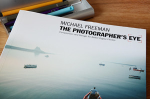
Photo of the front cover of Freeman's ook lying on a desk
The Photographer’s Eye

I am really enjoying the tone and feel of Michael Freeman’s (2007) book, it includes a sumptuous range of images and has clearly had an influence on how the Art of Photography is shaped.

I hadn’t got very far, the Introduction in fact, before I was wrestling with a number of what seemed like key issues:

  • Recognising the decision making behind the taking of a photograph
  • The relationship between the kit and composition
  • My own relationship to the equipment
  • The impact of the immediacy of digital photography
  • Why design has been neglected in the teaching of photography
  • The place of the digital darkroom and post-production possibilities

These feel like pretty weighty points to consider and I imagine they will sit with me for some time. I am sure I will keep returning to them as my work evolves and the course progresses.

As Freeman (2007: 6) himself says:

“This comprehensive control inevitably affects composition and the simple fact that so much can be done with an image in post-production increases the need to consider the image and its possibilities ever more carefully.”

Reference:

Freeman, M. (2007). The Photographer’s Eye: Composition and design for better digital photos. Lewes, East Sussex: Ilex Press Ltd.


August 18

The photograph as contemporary art: Charlotte Cotton

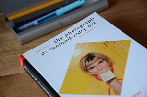
The Photograph as contemporary art book lying on a desk
A series of curations?

I have not quite finished reading this book yet and I think it will take me some time to mull it over and reflect on what it offers when I do finish it. A few things have already struck me though. I do not have any issue with the notion of photography being part of the contemporary art field, which is perhaps why, on occasion, I found this book a little frustrating. I think the old notions of distinct artforms and sectors are becoming increasingly redundant as the boundaries are blurred by practice. Artists and other creatives are regularly working across forms and do not recognise the arbitrary boundaries that are often imposed by funding, the gallery system or other external policy structures.

To be fair it is made clear in the introduction that the aim of the book is to ‘work as a survey, the kind of overview you might experience if you visited exhibitions in a range of venues…’ (Cotton, 2009: 7)

The themes are wide ranging from storytelling and emotions to materiality and documentary. Reading Cotton’s background my sense of the chapters being a series of ‘curations’ starts to make sense, they feel like a number of shows that have coalesced under the banner of contemporary art. I would really have liked to have heard more from Cotton herself in terms of why some of her choices were made; how the themes evolved and what made her select the photographers/artists she did. You do get glimpses of this as you read through but I would have preferred it to have been more overt.

I will keep reading and see what else surfaces.

Reference:

Cotton, C. (2009). The photograph as contemporary art (2nd ed.). London: Thames & Hudson.


August 17

Positioning the Horizon – Hadleigh Farm

Title: Hadleigh Farm

Exercise: Find an interesting external view that includes a clear and unbroken horizon. Experiment with taking views with the horizon in different positions across the frame from low to high.

Approach: I had my camera with me to take photographs of the Women’s Olympic Mountain Bike race at Hadleigh Farm in Essex. When I arrived I found the venue had great panoramic views out across the Thames estuary towards Canvey Island and back towards London. This enabled me to take a number of shots experimenting with the horizon in different positions.

August 17

Assignment 1 – more reflections

16th August

Nearly time to submit my assignment now. I have eight pairs assembled and am relatively pleased with the results. There is no doubt my confidence grew as the ideas and the work progressed.

How did it go?

Technical and visual skills: I worked hard to develop my observational, design and compositional skills in creating these pairings. The more I developed the ideas the more I found I was really looking into the images and seeing issues such as balance and focal points. I tried to incorporate the learning from the initial exercises – different focal lengths and depths of field, lighting, intimate images and wide vistas. I have also come to understand more about what Hunter et al (2012: 3) so eloquently describe as lighting being the language of photography, ‘patterns of light convey information just as surely as spoken words.’ Through developing this series of images I have become more aware of looking at light and thinking about how it conveys the messages I am trying to develop.

Quality of outcomes: I think the contrasting pairs improved over time and I was definitely getting into my stride by the end. They are presented in chronological order from more or less the first to the last shoot, although there was inevitably some iteration on the way as I changed different elements or built on an idea. I think the strongest pair is continuous/intermittent. I think it is an interesting interpretation of the concepts and the images are quite strong because of their use of colour, light and balance. The weakest pairing is possibly hard/soft as it is one of the most literal and neither image has a specific point of focus, they are both reliant on colour and texture for their interest.

Demonstration of creativity: I think I have demonstrated a degree of creativity in developing my own interpretation of the concepts and ideas. I deliberately tried out techniques I had not used before such as the dripping liquid and using the light tent. I also made sure I experimented with scale, lighting, colour and depth of field. I feel I am starting to develop my own voice, something perhaps playful, tongue in cheek even a little quirky and I’d like to see this develop more as I build my confidence.

Context: I have done some research in the last few months but possibly not as much as I would have liked. Looking at a variety of work, even if only in reproduction/on the Internet has proved very helpful – particularly the likes of Chris Nash, Anne Zahalka and Marion Drew.

I have tried to reflect as close to the event as possible and build my fieldbook but I have struggled with loading it online. It has all sat in a neat pile waiting to be loaded up leaving me with a lot to do at once.

Overall, I think I am happy with what I have achieved. It is my first attempt at a small body of  work structured around a theme and I enjoyed the process of building up the ideas and executing them. Inevitably, some ideas were better than others and some of the execution is more accomplished than others.

What have I learnt?

  • Time is needed to let the ideas emerge and build my technical ability – more time than I might have thought
  • I still carry a bit of mentality probably inherited from the days of film that you don’t take too many images. In both the oranges pair and ‘liquid/solid’ I took far more photos than I would normally do and this helped me have a wider choice of what to include
  • My confidence has grown across the last few weeks as I found I could start to execute the kind of images I was looking for
  • I definitely have a preference for close-up and detailed work but need to be careful to develop a wide range of approaches
  • I am more comfortable with taking the camera off its ‘auto’ setting and playing with shutter speed and aperture manually. I still don’t always know which way to adjust to get the effect that I want but I am now very happy with experimenting

In terms of taking my learning forward I am becoming increasingly more conscious of framing and thinking through/about the image that I am looking for. I need to develop my technical skills further both with the camera and Photoshop so I can get closer to what I want more quickly. I also think I need to know when to take time and when to speed up dependent on the nature of the shots I am taking. I have been encouraged by Hunter et al’s (2012) notion of getting to a point where you can recognise when your camera is helping and when it is hindering.

Reference:

Hunter, F., Biver, S., & Fuqua, P. (2012). Light Science & Magic: an introduction to photographic lighting (4th ed.). London: Elsevier.
August 17

Asignment 1 – Thinking in Contrasts

Some initial thoughts on the assignment (1st August 2012)

I had read the assignment instructions several times before this point so it felt like I had been holding the list of contrasts in my head and thinking about possible subjects for a while. I started by looking at the published list and then listing my own ideas for each category – I soon found that ideas flowed easily in some areas whereas others needed more time to ponder. I also talked to family members and we played word association games with the various pairs.

I then went back through all the photographs I had taken since April to see what I could find there. A number of pairs quickly emerged and they also provided ideas for new images – particularly the canal in Birmingham. I found with a number of the categories I was already thinking in terms of colour and shape.

Once I started taking photos one idea seemed to spark the next, initially I thought  about using a lot of buttons or ribbons for the ‘many’ category, and that sparked me seeing the rug differently – as a possibility for ‘soft’ – I then moved onto its contrast ‘hard,’ and so on.

I also used it as an opportunity to experiment with my light tent and lights for the first time as a number of the initial ideas were relatively small subjects that would easily fit into the tent. I was however, also concerned with trying different styles and subjects and not getting too stuck in the small scale, close up, which I know is a preference.

Once I started the ideas and contrasts seem to jump out from all sorts of places. While I was out driving I spotted the lines of trees that have become the ‘straight’ contrast, they were so striking from the road. I am learning to have my camera with me as much as possible.

As the images and pairs were evolving it also made me wonder about the socially constructed nature of the categories and that their relationships with the visual were actually quite complex. So, for example, how do you see ‘sweet and sour’ they are after all in the sensory domain of taste, and is my sweet and sour the same as other peoples’? So even if I produced a representation of sweet and sour such as images of sugar and lemons it would not necessarily have the same meaning for every viewer. I could see how in future this might stimulate a project in its own right.

August 17

Assignment One Contrasts

Assignment One – contrasts        Dawn Langley      510320

 This assignment required me to consider a basic design principle – that of contrast. We were given a list of possible contrasting pairs such as long/short; thick/thin; hard/soft etc and asked to create eight pairs that somehow expressed the essential differences between these qualities. Here is what emerged:


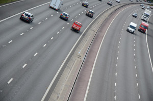
The M3 motorway seen at an angle so it curves away to the top right
Wide
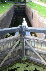
Picture of lock gates leading into a narrow canal lock
Narrow

In this pairing I had the idea for the motorway as a ‘wide’ road first and that then led me to think abut the canal as its counterpoint. Using the tilted shot I tried to exaggerate the width of the M3, in the same way as the pointing of the lock gates seemed to emphasise the narrowness of this lock on the Basingstoke canal.There is no doubt that I was inspired by having recently been by the canals in Birmingham!

A collections of second zips tumbled together some have threads in them
Many
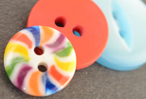
Three buttonsnext to each other close up in bright colours
Few

These are obviously more domestically based images and as such I wanted to create shots that were close up to the subject matter. I pondered about tidying up the zips and removing the cottons but as they have all been removed from old clothes this detritus seemed to me to be part of their story so I left them in.


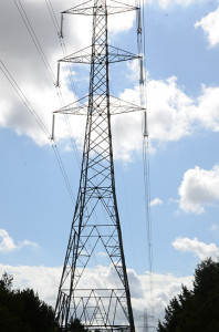
An electricity pylon seen almots overhead with a second small pylon in the distance
Large
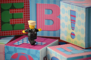
A small lego figure marching across some alphabet blocks towards the right
Small

I took the shots of the pylons when I was photographing the motorway. They looked to me like giants walking through the woodlands. I thought this contrasted well with the small Lego figure that I combined with the alphabet blocks to try and give a sense of scale. I was also starting to explore the differences between found and ‘staged’ images.

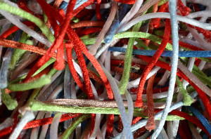
a jumble of bright colour synthetic threads on a rug
Soft
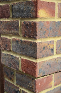
Brickwork on the side of a house seen from the corner
Hard

This pair was perhaps more difficult than I thought it might have been because it relies on cultural constructions to be able to make the meanings work. Soft and hard are sensory and generally based on touch so being able to convey them visually is more of a challenge. I am reliant on observers knowing that bricks are hard and the pile of a rug is soft.


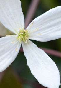
Small white Armandii flower cropped to take up all of the frame
White
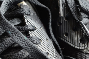
Pair of black trainers seen close up by the laces
Black

I wanted to try an unusual combination for black and white using contrasts not just between black and white but also natural and man made. They are both close up shots in an attempt to magnify the differences.

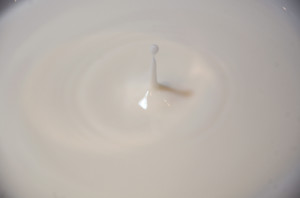
a slow motion drop of milk falling into a bowl of milk
Liquid
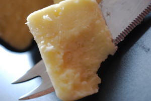
A slice of cheese with a cheese knife behind it
Solid

This is a pairing where I wanted to play with the elements, cheese being a ‘solid’ outcome of processing the liquid milk. I had never photographed dripping liquid before and it took a lot of patience to try and get anything that worked.

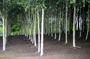
Birch trees all planted in straight lines
Straight
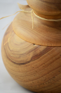
A turned wooden pot with a round lid on top
Curved

This pairing was also a slight play on the constituent elements. The straight planted rows of trees contrasted with the curves of the turned wooden jar.

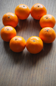
8 small oranges arranged in a circle on a wooden table top
Continuous
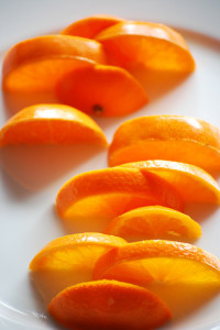
Half slices of orange arranged on a white plate so there are gaps between them
Intermittent

This final pairing came about as my confidence and ideas were growing. I wanted to play with the notion of circles being continuous and oranges came to mind this then led to thinking about cutting them into slices and taking out odd segments to create gaps.


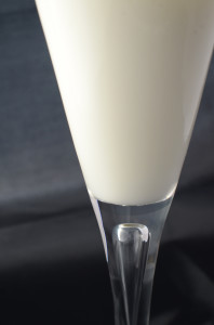
A fluted wine glass of milk against a balck and grey background
Opaque and Transparent

This final image is my interpretation of two contrasts in one, those of opacity and transparency. Milk in a wine glass set against a dark background. I didn’t want to make the subject too obvious so worked on the framing, positioning and colour of the glass and its contents against its background.


August 17

The Horizon – Hadleigh Farm

Positioning the Horizon (11th August):

I had the good fortune to get tickets to the Olympics women’s mountain bike final at Hadleigh Farm in Essex. This gave me the unexpected opportunity to do the horizons exercise as the views across the bike track out towards Canvey Island were really open and had incredible depth. The three images on the exercises page show the horizon as low in the frame, near to the middle and high in the frame.

My preference is for the low horizon, although I would want to remove the irritating lighting gantry in the centre of the shot. I prefer this because I like the way the almost misty effect on the horizon merges into the sky with its gradations of cloud. It was an extremely sunny day so I was pleased to see there was still some detail in the sky. I also like the two pink Olympic flags to the right of the image that just give a hint of something else happening.

As suggested in the course text I feel the mid horizon is the least successful because it is the least dynamic, it just divides the fame and makes the shot seem very flat. There is still some interest in that the pink staging markers perhaps make you wonder what this and where this place might be but overall it is not very interesting.

The high horizon obviously gives more sense of the activity in the foreground and definitely gives a sense of depth across the farm and the houses down to the estuary and across towards Canvey Island. The fact there is less detail in the sky doesn’t seem to matter as there is plenty happening in the foreground. However, I do think the foreground is probably too busy and would warrant some cropping of the out of focus figures bottom left.


August 17

Focal lengths and more…

The W (20th July):

It was hard to be anywhere along the harbourside in Barcelona and not notice the incredibly dominant presence of the ‘W’ hotel. I actually found the extent of its impact made me increasingly uncomfortable. In the light of all that is happening economically in Spain at the moment its position almost seemed grotesque. Barcelona is heavily dependent on its tourism yet as with other tourist destinations this is seen as a very mixed blessing by residents. The pollution and noise caused by the constant tour buses, the increased property speculation driving out locals in Barcelonetta and so on. Around the city a number of banners are hung encouraging tourists to go home and not return. One protest group talks about tourism and economic models that are destroying the city. So while this was another technical exercise in terms of experimenting with focal lengths and my zoom lens it also feels like a political commentary for me. I guess this probably does not come across in the image if you don’t know the backstory, but this hideous structure really looms over the city and symbolises for me the very real dilemmas created by the collapsing economic systems.

This prompted me to look more at how tourism might be defined and what it means, this is an interesting post by José Antonio Donaire looking at the subject. Another project for the future maybe?

Sorry I digress, but this really got me curious about the symbolism and iconography around tourism and our cities.

August 17

Focal lengths

Bike Circles (20th June):

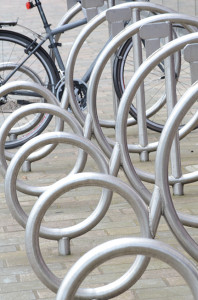
A series of metal circles that form a bike rack with one bike at the far end.
Bike Circles: FL 82mm 1/30 f/18 ISO: 160

These few days in Birmingham have provided some rich material for my exercises. Although I focussed on a narrative progression at The Public when I arrived I found a series of metal circles designed as a bike stand. It was visually very arresting and I decided to have another go at the focal lengths exercise. This is a set where I was hard pressed to decide on a single shot I preferred. I think the nature of the subject means it works relatively well across the three versions. If pushed for a preference it would probably be the mid focus shot because the bicycle gives some background detail but the shapes of the bike rack provide interest in the foreground.