February 28

Serious business

It is evident that the BSL group has become more confident over the weeks. We sit in an almost silent room, hands moving, eyes watching attentively. Conversations are beginning to build, handshapes are clearer and there is no doubt that vocabularies have expanded. That not to say we don’t all have our moments of frustration over a forgotten sign or one that is as yet unknown.

At one point during today’s session we played a guessing game. We had learnt a range of country names last week and this was a fun way to remember. Our tutor signed or fingerspelt a food or national dish and we had to guess both the food and the relevant country and then sign back the country name. It was delightful in its innocence and simplicity. As I looked around the room everyone appeared completely entranced, we had been set a challenge and we were not going to found wanting!

Much laughter and scratching of heads later and all the countries were covered. I think we made a pretty good showing although that’s not say our recollection was perfect. I have been pondering since what it was that worked so well for me, and a number of things have come to mind.

  • There were no harmful consequences to getting it wrong and as such there was nothing to be lost by giving it a go
  • It was undoubtedly helping us to both practice signing and remember some specific signs
  • It was fun – more of a quiz than a test

We were enjoying ourselves and this was helping us learn, now it is true that I still may not remember all the signs, but I will certainly recall this as an activity that helped me relax and enjoy the process of learning. There was also something in it that felt a bit irreverent, as adults learning something new it was perhaps not seemly to be enjoying ourselves.

This sentiment is supported by others, like Armstrong, who have looked at fun and adult learning:

There is a lack of literature on the use of humour in adult learning or the process of making adult learning fun. Most certainly, learning and fun are assumed to go together as far as young children are concerned. But later education becomes a serious business. And, if anything, learning has become more serious over the past decade or so. In the UK, the mainstreaming of university adult education has reduced the amount of learning for its own sake, for enjoyment. A major concern within adult education is that students should not be attending classes to be entertained.

Yet many years ago the power of collective laughter was recognised as something valuable:

When a class and its teacher all laugh together … they become a unit … enjoying the shared experience. If that community can be prolonged or re-established, and applied to the job of thinking, the teacher will have succeeded. (Highet, 1951: 56-57)




Category: BSL | LEAVE A COMMENT
February 23

A touch of kindness

I was really struck by the story of Billy Ray Harris and his selfless return of a diamond engagement ring today. As someone who has also experienced a number of particular kindnesses this week my faith in the power of our capacity to care is renewed.

It also reminded me of some work I did a while ago about the importance of having hope in our lives.

Category: Blog | LEAVE A COMMENT
February 20

A life well lived

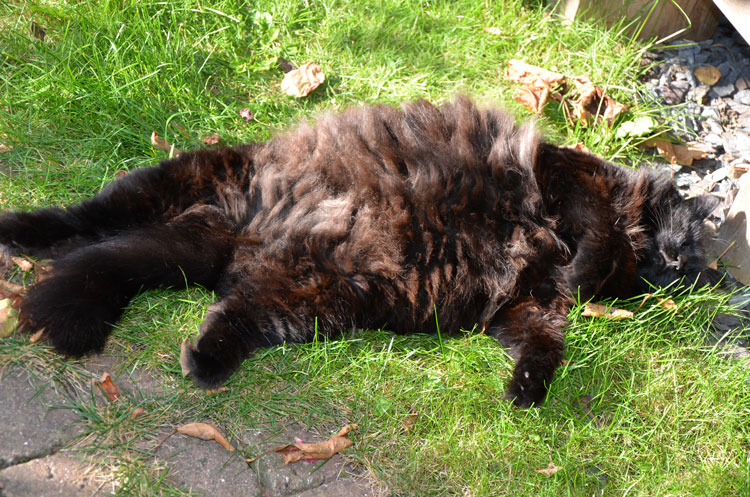
Yesterday was not an easy one, we had to face that moment that all pet owners dread. Phoebe’s health had plummeted over the weekend and she was found to have an aggressive Pancreatic cancer. She was in terrible pain and very depressed so there was no choice in my mind, we had to say goodbye. I would not normally post such a personal blog but I have been thinking a lot about what she taught us and indeed what we might learn from her loss. It is also in some way comforting to capture her essence here and recognise all she brought us.

Her story

Phoebe was discovered amongst a bundle of other kittens in a local pet shop. She was a big, black, long-haired kitten, a bit like a four legged Tarantula! I was not in the shop to buy a kitten and passed the pen to pick up the food I needed. Half way past I felt a small tug at my jeans. I looked down and there was this little creature with paw fully outstretched through the cage bars grabbing at me. We were instantly connected, but I did not melt immediately, at that point we already had five other cats. I left the shop to discuss whether we could have yet another cat and my partner in his wisdom said he trusted me to do the right thing.

The next day Phoebe launched herself fearlessly into the midst of the five resident cats apparently completely oblivious as to why they might not welcome her arrival. The Princess had arrived. I was to learn later from my partner that this was not the decision he had trusted me to make!

She was a great chatterer and although you might not always get the complete gist of what was being communicated there was no question that some sort of message was being delivered, it was usually a matter of working through a set of possible alternatives. I think she knew Bateson’s levels of learning more intuitively than I did!

In her younger days she was an accomplished mouser and general bringer of gifts, even producing the head of a Pampass grass on one bizarre occasion. She was always a big cat and not the most agile or graceful of movers, but what she lacked in grace she more than made up for in strength and speed. My apologies go out to the budgerigar owner if the smattering of bright blue and green feathers I found one day in the dining room were not from a wild bird!

Over the last few years there is no doubt that life had slowed down for her, (she would have been 17 this year) she still adored lying in the sun on the deck or by the bamboo. Although she was never a lap cat, physical contact became increasingly important and she would demand it in no uncertain terms – stroking, brushing, just a general recognition of her presence. You were allowed to stroke or brush her until she deemed she had had enough and then she would find a favourite haunt, usually in the upturned cardboard lid from a printer paper box by the radiator. To say she was a snug fit would not quite describe the curious sight of her rolling over the top of it. We often joked about, ‘does my bum look big in this!’

Likes and dislikes

She really liked:

The sunshine and sitting in front of the bamboo

Roast chicken, pretty much fresh from the oven

Food generally, up until her Pancreas caused her problems

Being brushed

Sitting full length on the outstretched recliner chair

The lids of printer paper boxes

Tigger and the orange blanket on the futon

Chatting

She really disliked:

Darcey, the neighbour’s cat – he is a bit of a bruiser

Snow

Rain

Builders

Having her claws trimmed

Being in the basket to go to the vet

Flea treatment

Being ignored when she wanted something

One of our other cats being where she wanted to be


Learning from connections and loss

Her life taught us the value of stopping sometimes. Of seeing through different eyes and in doing so being able to reflect on Bateson’s question:

What pattern connects the crab to the lobster and the orchid to the primrose and all the four of them to me? And me to you?… what is the pattern which connects all the living creatures?

Gregory Bateson, (2002 Ed), Mind and Nature: A necessary unity.

Bateson tried to point out the shortcomings of the purposeful rational mind – for him dreams, religious experience, art and love were the phenomena that still had power. I believe Phoebe’s death teaches me to reconnect with my emotions, not those neatly managed emotions of the everyday, but the deep senses that remind me of my connectedness to a wider system. Such emotions that are often put aside as we dash from e-mail to text to meeting and back again.

It reminds me that control is an illusion and that loss is hard and creates a significant change in our lives. I remain convinced it is better to have those connections and learn from my sense of loss than not to have them for fear of the pain they might bring.

Sunbathing
Sunbathing
Her favourite pose
Her favourite pose

Phoebe is survived by Benson, Spike and Jinx who are 18, 17 and 17 respectively. She will leave a huge gap in the household but we know from experience that over time the raw pain fades and memories of this big character, who chose to live with us for so long, will make us smile again. We will come to know anew the things she connected us to.


Category: Blog | LEAVE A COMMENT
February 18

Cartier-Bresson: A Question of Colour

Sadly, I didn’t get to see the exhibition in the flesh but I was told about it by a friend and have since had a chance to track it down online. It was such a shame that I missed it because I think it would have been a really good experience in terms of thinking about colour for this part of the course.

Cartier-Bresson: A Question of Colour features the work of a select number of photographers whose commitment to expression in colour was (or is) wholehearted, sophisticated, and measures up to Cartier-Bresson’s requirement that content and form were in perfect balance.

A Question of Colour included an auspicious group of contemporary colour photographers.

Initially, I was just going to include those photographers/images that particularly resonated with me but as I looked at their different styles and approaches they each offered something new. Those that strike me now, like Trent Park and Carolyn Drake, may not be the ones that have meaning a few months down the line. So I have captured them all for now, leaving myself the option for more research in future.


February 18

Technicolour

Green with envy

Purple with rage

Seeing red

Happenstance led me to the BBC Radio 4 Technicolour programme while I was travelling the other week and I have since listened to the whole series. A set of short broadcasts it explores various aspects of our understanding of, and relationship to colour, covering:

  • Vision
  • Naming
  • Feeling
  • Making
  • Selling

The broadcasts cover everything from colour blindness to the environmental impact of the dye trade. During one interview with an interior designer she said:

Nature creates harmonious colours…nature doesn’t get it wrong.

I found this an interesting observation as it was primarily nature that I used in creating the photos for my assignment that required harmony between similar colours.

While this wasn’t a visual experience as such the debate around the socially constructed nature of colour is fascinating, in particular the notion of how or if language affects our perception of colour. I hadn’t realised if but apparently the first word we had for a colour was red, followed by green and yellow and finally blue. I also discovered that the Russian language includes more words for blue than English and psychologists are now studying whether this means that Russian people see colour differently to people with English as their first language.

It also seems that there are some women who have ‘super’ colour vision, these so called Tetrachromats can see four distinct ranges of color, instead of the three that most of us live with. If you are based in the North of England visit the BBC website to find out if you have this superpower!

If you didn’t manage to catch it the series is well worth tracking down on the BBC iPlayer.

February 18

Reflections on assignment three

It has been somewhat discomforting to discover just how challenging I have found this assignment. It was in many ways the one I was most looking forward to; yet to focus so specifically on colour has really not been easy. Unlike the Design and Contrasts assignments, I found it very difficult to have the images in my mind’s eye before I started on the various colour shots. Whereas I did some sketches beforehand for the design module, for the colour assignment I found I had to spot the colours first and then think about possible combinations.

In some ways it felt much more contrived that the previous assignments even when the images were of naturally occurring colour schemes. That said I did find I was starting to notice colour combinations more readily. This series was shot over about six weeks, I made quite good progress for the first fourteen images but the last two were a real effort and I rejected a number of compositions because I just wasn’t getting images I felt worked. As with previous assignments I still feel some of this set work better than others but it has been a very good learning experience in terms of being more aware of how I work with colour.

Technical and visual skills

I think that with each assignment my observational skills and visual awareness grow, it is not necessarily easy to explain how this is happening because it often feels quite intuitive, a tacit learning that cannot be spoken. I am definitely more aware of composition and I think I am taking more time over creating the sort of image I am looking for. Use of bracketing, changing the white balance and using different lenses is helping me to feel more confident with the camera. I also find I am scrutinising the images in Photoshop more, looking at depth of field and cropping and so on.

I spend a lot of time looking at the images after I have taken a particular set finding at the ones I think work better than others; often one or two will immediately stand out. If I like certain elements but do not feel I have found the final image I will re-shoot building on what I have already learnt. I also talk to members of my family and friends about which images they feel work better – sometimes enlightening and sometimes infuriating!

Quality of outcomes

I have very mixed feelings about this set of images, partly because it feels like it has been quite a difficult process to complete the group. I like to think there is some consistency across the images and that I am building a style but that I am also still experimenting and trying different approaches. I think I have a natural preference for the stronger colours and simple composition but I am pleased to have worked more with landscape this time.

I have also included one or two slightly quirkier images again to keep a sense of humour in the work and to try and produce some slightly unexpected combinations. A very long time ago I did printmaking and painting and now I look at the images as a set I think some of that influence is starting to show.

Demonstration of creativity

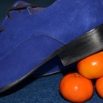
I have tried as much as possible to experiment with different approaches and to use different angles and focal points. As I have reflected on elsewhere I did find this more difficult for this assignment where colour was the main driver. I am aware I have a growing love of food photography but I deliberately did a range of work outside to ensure I am building my experience and skills. I also tried to combine unexpected elements like the shoes and the Satsumas to show a more imaginative approach to working with the colours involved.

Although this assignment was focussed on colour I am aware that I am increasingly conscious of texture as well and how that can be used to build interest in an image. I have tried to use and develop my creativity and produce a set of images that are visually interesting and intriguing, I guess inevitably some achieve this better than others. I think I was particularly pleased with some of the ‘found’ scenes like No Road Markings and the Pallets because it felt as though they were opening my work up more.

Context

I have continued to reflect on the different exercises as I completed Part Three of the course, in particular capturing what I felt was working and those areas I was finding more challenging. This is an important part of the process for me as I think it is helping to build my understanding of what I want to achieve and to develop my own ‘voice’ and style.

I have continued to do some reading but have not had much time to write this up in my blog yet, which I must try and do. I have also been trying to get to more shows and see the work of different photographers as I am finding that is a great way to think about how my work might develop. It is really helpful to look at other people’s work and to try and analyse why I am having the response to it that I am.


February 18

Assignment Three: Colour

Colour harmony through complementary colours

In taking these images I tended to use objects that gave me some control over the colour combinations and as such they are all constructed.  In both ‘Squash’ and ‘Rough Seas’ I worked around a single object to start with (the shoes and the yellow duck) and that then suggested what I might use with them for the appropriate colour combination. The ‘Romanesco’ are such extraordinary structures in their own right I felt they did not need a lot of detail around them. ‘The Race’ was created when I collected a number of small objects from around the house to see what they suggested, originally I had something blue in mind based on a large marble but then I saw that the Tortoise and the bus were about the same size and they worked together in terms of colour and scale.

 Colour harmony through similar colours

Unlike the set above when I was working on this set of images I found it was mainly natural colours that worked best. I tried using artificial colours in terms of different sewing materials but just couldn’t create a composition I was happy with. Landscapes and food seemed to give a more pleasing blend of colours and provided the sort of effect I was looking for.

Colour contrast through contrasting colours

In creating this set I was able to use both constructed and naturally occurring scenes. I particularly wanted to see if it were possible to find such contrasts in nature. Although they are subtler in ‘Log Pile’ and ‘Gorse’ I thought that they illustrated combinations of green and orange and green and violet as I found them in the environment. ‘Oops’ (orange/violet) and ‘Smile’ (blue/yellow) are obviously constructed and deliberately illustrate more vivid combinations.

 Colour accent using any of the above

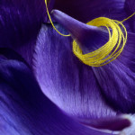
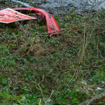
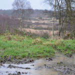
I had expected with the colour accent set to use primarily constructed arrangements but I was either lucky or my eyes had become more attuned in finding colour combinations. While ‘Raining’ includes a subtler colour accent I was really struck by the colour of the grass against its more muted, brown surroundings. ‘No Road Markings’ was something I found as I was taking ‘Log Pile’ above. The land around it was completely flooded so I couldn’t get to it the right way up but there was something about it having been abandoned alongside a broken red bumper that I thought worked. Similarly in ‘Pallets’ my eye was immediately drawn to the one blue pallet near the bottom of the stack. ‘Petals’ was something I had played with in an earlier exercise that I then came back to and developed to produce this image. The combination of the yellow cotton thread against the violet petals I felt really highlighted the power of a small accent of colour.


February 17

Gestalt and the organization of visual perception

There is much to learn from Michael Freeman’s ‘The Photographer’s Eye’ but two things particularly stand out for me so far – Gestalt and Figure/Ground. Now I think about it they probably shouldn’t be a surprise, but these are approaches I use in my consultancy work with organisations and hadn’t really thought about in relation to visual perception.

When I read about it of course it makes perfect sense, and it was fascinating to make the new connection, even if I kick myself for not having thought about it before. One of the things that has always appealed to me about Gestalt is that notion of ‘seeing’ the whole, the need we have as human beings to complete the whole.

Modern Gestalt theory takes a holistic approach to perception, on the basic principle that the whole is greater than the sum of its parts, and that in viewing an entire scene or image, the mind takes a sudden leap from recognizing the individual elements to understanding the scene in its entirety.

Gestalt theory gives us a number of laws of perceptual organization that are important in considering how images might be composed and what is happening perceptually for the viewer:

  1.  Law of proximity: visual elements are grouped in the mind according to how close they are to each other
  2. Law of similarity: elements that are similar in some way, by form or content, tend to be grouped together
  3. Law of closure: elements roughly arranged together are seen to complete an outline shape – the mind seeks completeness
  4. Law of simplicity: the mind tends towards visual explanations that are simple; simple lines, curves and shapes are preferred, as is symmetry and balance
  5. Law of common fate: grouped elements are assumed to move together and behave the same
  6. Law of good continuation: the mind tends to continue shapes and lines beyond their ending points
  7. Law of segregation: in order for a figure to be perceived, it must stand out from its background. Figure-ground images exploit the uncertainty of deciding which is the figure and which is the background, for creative interest

(from Freeman, 2007: 39)

Some graphics examples of these laws at work can be seen at graphicdesign.spokenfalls.edu – I particularly like the WWF Panda logo as an example of how the law of closure works.

Normally, in presenting information, making the viewer’s mind work harder is not considered a good thing, but in photography and other arts it becomes part of the reward for viewing.

Freeman, 2007: 38

February 15

A woman photographing women

With an aim to capture the many roles of women in society, Bohm juxtaposes the images of women that surround us in advertising, artworks and shop windows with real women living and working in the capital – revealing the contrasts, similarities and gaps between ideals and expectations of the feminine and real life women in everyday situations.

Museum of London press release

I actually saw the Dorothy Bohm exhibition before I went to the Ansel Adams show but for some reason the writing did not come easily for this visit. I think it is partly because I was disappointed and there seemed to be something disloyal in saying so. Although, the disappointment was less to do with the work and more to do with the way it has been presented. Dorothy is an important photographer but this show might have led you to think otherwise. The light levels were incredibly variable – in one corner I found it was almost too dark to see the images at all. Sandwiched between two interactive spaces and a cafe I found the leaking noise incredibly distracting.

Why bother going into this much detail about the presentation? Because for me it really highlighted the delicate relationship between photographer, image and viewer. My ability to ‘read’ the work was significantly influenced by the setting in which I found it. In this setting it was hard to see Dorothy’s work for the position it should occupy and in a sense it almost reinforced the sense of invisibleness of the women I felt in some of her images.

 As a woman photographing women, I hope that I have shown in my pictures that I understand, sympathize and can identify with my subjects. I never want to take hurtful pictures. I have tried to show the contribution women make to the very diverse, exciting, colourful if sometimes stressful London life

Dorothy Bohm

There is a sensitivity in these images and a keen eye for the extraordinary in the ordinary. On this basis the images seem to straddle photo documentary, ethnography, and portraiture. Some of the images made me smile and overall it was good to see a show by a woman of women.

The photograph fulfills my deep need to stop things from disappearing. It makes transience less painful and retains come of the special magic, which I have looked for and found. I have tried to create order out of chaos, to find stability in flux and beauty in the most unlikely places.

Dorothy Bohm