Assignment Three: Colour
Colour harmony through complementary colours


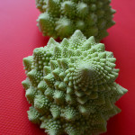
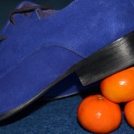
In taking these images I tended to use objects that gave me some control over the colour combinations and as such they are all constructed. In both ‘Squash’ and ‘Rough Seas’ I worked around a single object to start with (the shoes and the yellow duck) and that then suggested what I might use with them for the appropriate colour combination. The ‘Romanesco’ are such extraordinary structures in their own right I felt they did not need a lot of detail around them. ‘The Race’ was created when I collected a number of small objects from around the house to see what they suggested, originally I had something blue in mind based on a large marble but then I saw that the Tortoise and the bus were about the same size and they worked together in terms of colour and scale.
Colour harmony through similar colours
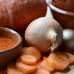
Unlike the set above when I was working on this set of images I found it was mainly natural colours that worked best. I tried using artificial colours in terms of different sewing materials but just couldn’t create a composition I was happy with. Landscapes and food seemed to give a more pleasing blend of colours and provided the sort of effect I was looking for.
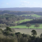
Colour contrast through contrasting colours
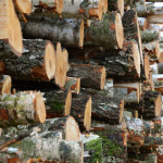
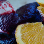
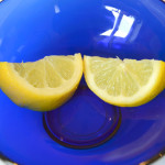
In creating this set I was able to use both constructed and naturally occurring scenes. I particularly wanted to see if it were possible to find such contrasts in nature. Although they are subtler in ‘Log Pile’ and ‘Gorse’ I thought that they illustrated combinations of green and orange and green and violet as I found them in the environment. ‘Oops’ (orange/violet) and ‘Smile’ (blue/yellow) are obviously constructed and deliberately illustrate more vivid combinations.
Colour accent using any of the above
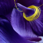
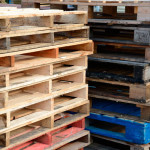
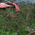
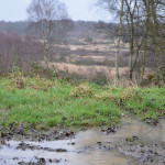
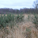
I had expected with the colour accent set to use primarily constructed arrangements but I was either lucky or my eyes had become more attuned in finding colour combinations. While ‘Raining’ includes a subtler colour accent I was really struck by the colour of the grass against its more muted, brown surroundings. ‘No Road Markings’ was something I found as I was taking ‘Log Pile’ above. The land around it was completely flooded so I couldn’t get to it the right way up but there was something about it having been abandoned alongside a broken red bumper that I thought worked. Similarly in ‘Pallets’ my eye was immediately drawn to the one blue pallet near the bottom of the stack. ‘Petals’ was something I had played with in an earlier exercise that I then came back to and developed to produce this image. The combination of the yellow cotton thread against the violet petals I felt really highlighted the power of a small accent of colour.