February 18

Reflections on assignment three

It has been somewhat discomforting to discover just how challenging I have found this assignment. It was in many ways the one I was most looking forward to; yet to focus so specifically on colour has really not been easy. Unlike the Design and Contrasts assignments, I found it very difficult to have the images in my mind’s eye before I started on the various colour shots. Whereas I did some sketches beforehand for the design module, for the colour assignment I found I had to spot the colours first and then think about possible combinations.

In some ways it felt much more contrived that the previous assignments even when the images were of naturally occurring colour schemes. That said I did find I was starting to notice colour combinations more readily. This series was shot over about six weeks, I made quite good progress for the first fourteen images but the last two were a real effort and I rejected a number of compositions because I just wasn’t getting images I felt worked. As with previous assignments I still feel some of this set work better than others but it has been a very good learning experience in terms of being more aware of how I work with colour.

Technical and visual skills

I think that with each assignment my observational skills and visual awareness grow, it is not necessarily easy to explain how this is happening because it often feels quite intuitive, a tacit learning that cannot be spoken. I am definitely more aware of composition and I think I am taking more time over creating the sort of image I am looking for. Use of bracketing, changing the white balance and using different lenses is helping me to feel more confident with the camera. I also find I am scrutinising the images in Photoshop more, looking at depth of field and cropping and so on.

I spend a lot of time looking at the images after I have taken a particular set finding at the ones I think work better than others; often one or two will immediately stand out. If I like certain elements but do not feel I have found the final image I will re-shoot building on what I have already learnt. I also talk to members of my family and friends about which images they feel work better – sometimes enlightening and sometimes infuriating!

Quality of outcomes

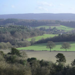
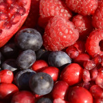
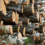
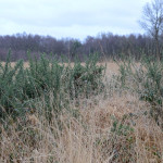
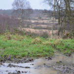
I have very mixed feelings about this set of images, partly because it feels like it has been quite a difficult process to complete the group. I like to think there is some consistency across the images and that I am building a style but that I am also still experimenting and trying different approaches. I think I have a natural preference for the stronger colours and simple composition but I am pleased to have worked more with landscape this time.

I have also included one or two slightly quirkier images again to keep a sense of humour in the work and to try and produce some slightly unexpected combinations. A very long time ago I did printmaking and painting and now I look at the images as a set I think some of that influence is starting to show.

Demonstration of creativity

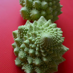
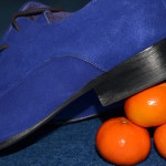
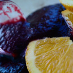
I have tried as much as possible to experiment with different approaches and to use different angles and focal points. As I have reflected on elsewhere I did find this more difficult for this assignment where colour was the main driver. I am aware I have a growing love of food photography but I deliberately did a range of work outside to ensure I am building my experience and skills. I also tried to combine unexpected elements like the shoes and the Satsumas to show a more imaginative approach to working with the colours involved.

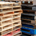
Although this assignment was focussed on colour I am aware that I am increasingly conscious of texture as well and how that can be used to build interest in an image. I have tried to use and develop my creativity and produce a set of images that are visually interesting and intriguing, I guess inevitably some achieve this better than others. I think I was particularly pleased with some of the ‘found’ scenes like No Road Markings and the Pallets because it felt as though they were opening my work up more.

Context

I have continued to reflect on the different exercises as I completed Part Three of the course, in particular capturing what I felt was working and those areas I was finding more challenging. This is an important part of the process for me as I think it is helping to build my understanding of what I want to achieve and to develop my own ‘voice’ and style.

I have continued to do some reading but have not had much time to write this up in my blog yet, which I must try and do. I have also been trying to get to more shows and see the work of different photographers as I am finding that is a great way to think about how my work might develop. It is really helpful to look at other people’s work and to try and analyse why I am having the response to it that I am.


February 18

Assignment Three: Colour

Colour harmony through complementary colours

In taking these images I tended to use objects that gave me some control over the colour combinations and as such they are all constructed.  In both ‘Squash’ and ‘Rough Seas’ I worked around a single object to start with (the shoes and the yellow duck) and that then suggested what I might use with them for the appropriate colour combination. The ‘Romanesco’ are such extraordinary structures in their own right I felt they did not need a lot of detail around them. ‘The Race’ was created when I collected a number of small objects from around the house to see what they suggested, originally I had something blue in mind based on a large marble but then I saw that the Tortoise and the bus were about the same size and they worked together in terms of colour and scale.

 Colour harmony through similar colours

Unlike the set above when I was working on this set of images I found it was mainly natural colours that worked best. I tried using artificial colours in terms of different sewing materials but just couldn’t create a composition I was happy with. Landscapes and food seemed to give a more pleasing blend of colours and provided the sort of effect I was looking for.

Colour contrast through contrasting colours

In creating this set I was able to use both constructed and naturally occurring scenes. I particularly wanted to see if it were possible to find such contrasts in nature. Although they are subtler in ‘Log Pile’ and ‘Gorse’ I thought that they illustrated combinations of green and orange and green and violet as I found them in the environment. ‘Oops’ (orange/violet) and ‘Smile’ (blue/yellow) are obviously constructed and deliberately illustrate more vivid combinations.

 Colour accent using any of the above

I had expected with the colour accent set to use primarily constructed arrangements but I was either lucky or my eyes had become more attuned in finding colour combinations. While ‘Raining’ includes a subtler colour accent I was really struck by the colour of the grass against its more muted, brown surroundings. ‘No Road Markings’ was something I found as I was taking ‘Log Pile’ above. The land around it was completely flooded so I couldn’t get to it the right way up but there was something about it having been abandoned alongside a broken red bumper that I thought worked. Similarly in ‘Pallets’ my eye was immediately drawn to the one blue pallet near the bottom of the stack. ‘Petals’ was something I had played with in an earlier exercise that I then came back to and developed to produce this image. The combination of the yellow cotton thread against the violet petals I felt really highlighted the power of a small accent of colour.


October 28

Reflections on Assignment Two

This was a challenging assignment that really made me look and think about the images I was trying to create. It was also a task that I particularly enjoyed. I think some images are better than others but overall I was very pleased with what emerged.

As with the last assignment I was fascinated to experience how one idea sparked something else, how simply playing with the different foodstuffs showed what might work and what didn’t. So, for example, I thought that working with sweet peppers would be very straightforward but I just couldn’t find the shapes and angles I was looking for. I did produce a few that made some peppers almost look like a coral reef but I didn’t think they were interesting enough compared to the other images.

Sketches in a notebook that were used to inform my photographs
Sketching some initial ideas

I took the images over a two-week period, allowing time for ideas to germinate and to study what I had already produced. Several times I awoke with a new idea forming that I then tried out. Before I took any photographs I did some sketches in my notebook, working through various ideas for each of the themes before I even put eye to viewfinder. That way I felt I had some sense of what I was looking for when I started to lay out the foodstuffs. The first five or six ideas flowed fairly freely and then things slowed down and I felt I had to work harder to create some new approaches, I felt I was in danger of repeating the same sorts of images just using different foodstuffs. The one that eluded me for most of the time was verticals and horizontals.

I also started to introduce some quirks, things you might not expect to be there like the screw in the cabbage and the pins in the kiwi, things designed to make the viewer do a double take. During this time I came across the still life work of Olivia Parker, which has no doubt served as a source of inspiration and influence, not to claim that my photographs are anything like the quality of hers but they gave me an added sense of enthusiasm and showed that approaches to still life could be surreal and non-traditional.

In terms of the course criteria I worked hard on the design elements of this exercise trying to go with and respond to the characteristics of the foodstuffs I was using and thinking about them in different ways. I used a wide variety of materials from silicon baking sheets to dress-making pins and from raw prawns to turmeric. I would like to think my visual awareness is quite good in terms of framing and thinking about composition, although I am aware some images are stronger than others.

I think the quality of the outcome from this assignment is relatively consistent, I am still working hard on building my technical knowledge but definitely felt more confident in working with the camera this time. I bracketed a number of shots and used a fully manual setting for much of the time. As Autumn rolls in I was very conscious of the quality of the light changing; many of the shots for the exercises to date have been taken at my dining table with good availability of natural light but this light is becoming more unreliable and is available for a shorter timespan. There were various ideas included in my approach this time with influences from still life painting and photography, fashion photography, surrealism and just the plain quirky. At times I felt a bit constrained by the need to work with specific shapes and forms but I hope there is a clear sense of intention behind the various images I have produced.

There is no doubt that as I worked on the assignment my imagination expanded and I was trying to be more playful with the objects. Not least because of my own desire to keep things fresh and interesting. Perhaps this could have been taken further if I were more confident technically. I do feel my voice is developing and my style is emerging but I also want to make the most of this opportunity to experiment and not become too predictable too quickly.

As mentioned before I have done background research into the different approaches to still life from possible Japanese influences in utilising a few elements in a very clean form through to the odd juxtaposition of cauliflower and cross head screw. The use of the screw and the pins in the kiwi were in part intended to be playful but were also prompted by my response to Susan Sontag’s comment about photography being an act of aggression, I think she was primarily referring to the objectification of people but it got me thinking about how this might appear when shooting non-human subjects. Was it possible to show a sense of aggression or to have the capacity to disturb when working with foodstuffs?

It feels like this is was an assignment I could have spent months even years producing and I do want to make sure I take its influences forward.


October 28

Assignment 2: Elements of Design

Pattern: Red Scales & Leeks

These two images were both examples of pattern and as a result also implied triangles. I was intrigued by the effect created by the moisture on the strawberries and that it made them almost seem ‘fleshy.’ This inspired later ideas in this assignment about presenting the food stuffs not quite as they are usually seen and juxtaposing unlikely combinations.

2 points: Salt & Pepper and Eggs & Flour

The salt & pepper and the eggs are obviously both examples of using two elements within a frame. The eggs were particularly difficult to work with because once they were dropped in the flour there was little I could change. As well as the focal points I was interested in exploring texture with both images. I was really pleased with the contrast of the glossy egg yolks against the powdery flour.

Curves and Rhythm:  Egg Cup and Spoons

The spoons were another attempt at creating a sense of rhythm in the frame.  I wanted to focus in on a detail of food preparation i.e. the herbs and spices but present them in such a way that they created an overall pattern. I also wanted to utilise the different textures and colours. The egg in the egg cup arose out of thinking about curves and I had sketched some thoughts around eggs and egg shells early on. The morning I took this photo there was very strong natural sunlight that I exploited to get strong contrast and emphasise the various curves present.

Single Points: Cauliflowers

Working with the cauliflowers was one of the ways I was thinking of creating a single point of focus that confused or played with expectations. Firstly by placing a piece of broccoli within the head of the cauliflower and then trying out something completely alien like adding the screw. With both approaches I wanted to use the different textures and shapes to highlight the contradictory points.

Diagonals and multiple points: Mushroom and Kiwi Beetles

The idea for using large mushrooms came to me early on in undertaking the assignment but I wasn’t sure how I was going to include them. Initially, I tried a number together to create a pattern but I didn’t feel the images worked particularly well. I then focussed in on a single mushroom and the diagonal emerged. With the judicious use of some dressmaking pins I pulled the two pieces together to accentuate the diagonal across the frame. I really wanted to capture the detail of the veins as they could be seen as diagonals in their own right.

The Kiwi Beetles were in part inspired by playing with the cauliflower. Again I had tried various configurations and when I looked at the early shots the hairs on the outside of the fruit intrigued me. They put me in mind of large spiders or beetles. So I thought I would play with that notion and used the pins to act as ‘legs.’

Distinctive shapes, horizontals & verticals: Pepper ribs and Pasta Sea

The pepper ribs were another attempt at creating some optical confusion and contradiction. Initially I was thinking about using the peppers to create a sort of topographical landscape but once I had sliced them up I couldn’t achieve what I had in mind. As I moved them to rethink the approach the slices fell in such a way that they looked like a rib cage. I then started to play with this idea and added the raw bacon to accentuate the illusion and move towards something slightly more grotesque than some of the other shots.

The horizontals and verticals had eluded me for most of the process but when I was working with the bacon it reminded me of the pancetta with its stripes of white fat so I decided to use this with the leeks. Thinking about these as ingredients for a pasta dish the pasta quills were then added. They looked to me like water lapping at the base of cliffs or around an island.

Several points in a deliberate shape: Prawns and Tomato Flower

Prawns was perhaps a more formalised composition compared to some of the others but I wanted to experiment with using just a few items to create a striking composition. I initially thought of the noodle nest and then the other elements followed. As a result of these ingredients I was partly inspired by the apparent simplicity of some Japanese graphics or paintings. As in one of the earlier exercises I added various items and moved them around until I felt I had found something that worked.

Tomato Flower was another approach to making the elements appear something they are not. The little Gem lettuce suggested an opening flower so I then used the parsley, carrot gratings and tomato to build the illusion of the stamens of a flower. I was particularly mindful of using the shapes and the colour to try and heighten the illusion.


August 17

Assignment 1 – more reflections

16th August

Nearly time to submit my assignment now. I have eight pairs assembled and am relatively pleased with the results. There is no doubt my confidence grew as the ideas and the work progressed.

How did it go?

Technical and visual skills: I worked hard to develop my observational, design and compositional skills in creating these pairings. The more I developed the ideas the more I found I was really looking into the images and seeing issues such as balance and focal points. I tried to incorporate the learning from the initial exercises – different focal lengths and depths of field, lighting, intimate images and wide vistas. I have also come to understand more about what Hunter et al (2012: 3) so eloquently describe as lighting being the language of photography, ‘patterns of light convey information just as surely as spoken words.’ Through developing this series of images I have become more aware of looking at light and thinking about how it conveys the messages I am trying to develop.

Quality of outcomes: I think the contrasting pairs improved over time and I was definitely getting into my stride by the end. They are presented in chronological order from more or less the first to the last shoot, although there was inevitably some iteration on the way as I changed different elements or built on an idea. I think the strongest pair is continuous/intermittent. I think it is an interesting interpretation of the concepts and the images are quite strong because of their use of colour, light and balance. The weakest pairing is possibly hard/soft as it is one of the most literal and neither image has a specific point of focus, they are both reliant on colour and texture for their interest.

Demonstration of creativity: I think I have demonstrated a degree of creativity in developing my own interpretation of the concepts and ideas. I deliberately tried out techniques I had not used before such as the dripping liquid and using the light tent. I also made sure I experimented with scale, lighting, colour and depth of field. I feel I am starting to develop my own voice, something perhaps playful, tongue in cheek even a little quirky and I’d like to see this develop more as I build my confidence.

Context: I have done some research in the last few months but possibly not as much as I would have liked. Looking at a variety of work, even if only in reproduction/on the Internet has proved very helpful – particularly the likes of Chris Nash, Anne Zahalka and Marion Drew.

I have tried to reflect as close to the event as possible and build my fieldbook but I have struggled with loading it online. It has all sat in a neat pile waiting to be loaded up leaving me with a lot to do at once.

Overall, I think I am happy with what I have achieved. It is my first attempt at a small body of  work structured around a theme and I enjoyed the process of building up the ideas and executing them. Inevitably, some ideas were better than others and some of the execution is more accomplished than others.

What have I learnt?

  • Time is needed to let the ideas emerge and build my technical ability – more time than I might have thought
  • I still carry a bit of mentality probably inherited from the days of film that you don’t take too many images. In both the oranges pair and ‘liquid/solid’ I took far more photos than I would normally do and this helped me have a wider choice of what to include
  • My confidence has grown across the last few weeks as I found I could start to execute the kind of images I was looking for
  • I definitely have a preference for close-up and detailed work but need to be careful to develop a wide range of approaches
  • I am more comfortable with taking the camera off its ‘auto’ setting and playing with shutter speed and aperture manually. I still don’t always know which way to adjust to get the effect that I want but I am now very happy with experimenting

In terms of taking my learning forward I am becoming increasingly more conscious of framing and thinking through/about the image that I am looking for. I need to develop my technical skills further both with the camera and Photoshop so I can get closer to what I want more quickly. I also think I need to know when to take time and when to speed up dependent on the nature of the shots I am taking. I have been encouraged by Hunter et al’s (2012) notion of getting to a point where you can recognise when your camera is helping and when it is hindering.

Reference:

Hunter, F., Biver, S., & Fuqua, P. (2012). Light Science & Magic: an introduction to photographic lighting (4th ed.). London: Elsevier.

August 17

Asignment 1 – Thinking in Contrasts

Some initial thoughts on the assignment (1st August 2012)

I had read the assignment instructions several times before this point so it felt like I had been holding the list of contrasts in my head and thinking about possible subjects for a while. I started by looking at the published list and then listing my own ideas for each category – I soon found that ideas flowed easily in some areas whereas others needed more time to ponder. I also talked to family members and we played word association games with the various pairs.

I then went back through all the photographs I had taken since April to see what I could find there. A number of pairs quickly emerged and they also provided ideas for new images – particularly the canal in Birmingham. I found with a number of the categories I was already thinking in terms of colour and shape.

Once I started taking photos one idea seemed to spark the next, initially I thought  about using a lot of buttons or ribbons for the ‘many’ category, and that sparked me seeing the rug differently – as a possibility for ‘soft’ – I then moved onto its contrast ‘hard,’ and so on.

I also used it as an opportunity to experiment with my light tent and lights for the first time as a number of the initial ideas were relatively small subjects that would easily fit into the tent. I was however, also concerned with trying different styles and subjects and not getting too stuck in the small scale, close up, which I know is a preference.

Once I started the ideas and contrasts seem to jump out from all sorts of places. While I was out driving I spotted the lines of trees that have become the ‘straight’ contrast, they were so striking from the road. I am learning to have my camera with me as much as possible.

As the images and pairs were evolving it also made me wonder about the socially constructed nature of the categories and that their relationships with the visual were actually quite complex. So, for example, how do you see ‘sweet and sour’ they are after all in the sensory domain of taste, and is my sweet and sour the same as other peoples’? So even if I produced a representation of sweet and sour such as images of sugar and lemons it would not necessarily have the same meaning for every viewer. I could see how in future this might stimulate a project in its own right.

August 17

Assignment One Contrasts

Assignment One – contrasts        Dawn Langley      510320

 This assignment required me to consider a basic design principle – that of contrast. We were given a list of possible contrasting pairs such as long/short; thick/thin; hard/soft etc and asked to create eight pairs that somehow expressed the essential differences between these qualities. Here is what emerged:


The M3 motorway seen at an angle so it curves away to the top right
Wide
Picture of lock gates leading into a narrow canal lock
Narrow

In this pairing I had the idea for the motorway as a ‘wide’ road first and that then led me to think abut the canal as its counterpoint. Using the tilted shot I tried to exaggerate the width of the M3, in the same way as the pointing of the lock gates seemed to emphasise the narrowness of this lock on the Basingstoke canal.There is no doubt that I was inspired by having recently been by the canals in Birmingham!

A collections of second zips tumbled together some have threads in them
Many
Three buttonsnext to each other close up in bright colours
Few

These are obviously more domestically based images and as such I wanted to create shots that were close up to the subject matter. I pondered about tidying up the zips and removing the cottons but as they have all been removed from old clothes this detritus seemed to me to be part of their story so I left them in.


An electricity pylon seen almots overhead with a second small pylon in the distance
Large
A small lego figure marching across some alphabet blocks towards the right
Small

I took the shots of the pylons when I was photographing the motorway. They looked to me like giants walking through the woodlands. I thought this contrasted well with the small Lego figure that I combined with the alphabet blocks to try and give a sense of scale. I was also starting to explore the differences between found and ‘staged’ images.

a jumble of bright colour synthetic threads on a rug
Soft
Brickwork on the side of a house seen from the corner
Hard

This pair was perhaps more difficult than I thought it might have been because it relies on cultural constructions to be able to make the meanings work. Soft and hard are sensory and generally based on touch so being able to convey them visually is more of a challenge. I am reliant on observers knowing that bricks are hard and the pile of a rug is soft.


Small white Armandii flower cropped to take up all of the frame
White
Pair of black trainers seen close up by the laces
Black

I wanted to try an unusual combination for black and white using contrasts not just between black and white but also natural and man made. They are both close up shots in an attempt to magnify the differences.

a slow motion drop of milk falling into a bowl of milk
Liquid
A slice of cheese with a cheese knife behind it
Solid

This is a pairing where I wanted to play with the elements, cheese being a ‘solid’ outcome of processing the liquid milk. I had never photographed dripping liquid before and it took a lot of patience to try and get anything that worked.

Birch trees all planted in straight lines
Straight
A turned wooden pot with a round lid on top
Curved

This pairing was also a slight play on the constituent elements. The straight planted rows of trees contrasted with the curves of the turned wooden jar.

8 small oranges arranged in a circle on a wooden table top
Continuous
Half slices of orange arranged on a white plate so there are gaps between them
Intermittent

This final pairing came about as my confidence and ideas were growing. I wanted to play with the notion of circles being continuous and oranges came to mind this then led to thinking about cutting them into slices and taking out odd segments to create gaps.


A fluted wine glass of milk against a balck and grey background
Opaque and Transparent

This final image is my interpretation of two contrasts in one, those of opacity and transparency. Milk in a wine glass set against a dark background. I didn’t want to make the subject too obvious so worked on the framing, positioning and colour of the glass and its contents against its background.