February 8

Colours into tones in black and white

This exercise was really intriguing. I had played around with effects in Photoshop before but had never really stopped to look at the implications of trying out different ‘filters.’ It was helpful to apply them to the same shot and see the changes; how the blues, greens and reds in particular altered with each application.

I think this will be a very useful reference set for later work.

February 7

Colour combinations

This exercise felt less constrained than the others so I used it as an opportunity to play and experiment. I took photographs of colours that caught my eye. I really liked the back lighting on the peonies and how they became translucent, the vibrant violet against the red and the grey sky through the window.

The leaf on the car bonnet was purely opportunistic. I had taken my camera with me and had been photographing puddles and raindrops and then spotted the leaf. I was really attracted by the way the leaf became almost luminous against the blue backdrop.

I had spotted the barriers in the snow while driving home one afternoon and went back the following day with my camera, I really liked the way the red punctuated the almost monochrome backdrop of snow and road.

I also liked the way the red jacket interrupted its green surroundings. I probably didn’t have a long enough lens at the time, as it might have been more effective if the figure were larger in the landscape. Nonetheless, I thought it reinforced the relationship between red and green as complementary colours and how they interact when in a different ratio than the 1:1 of the colour relationships exercise.

February 6

Colour relationships

If I thought finding the primary and secondary colours was hard this exercise proved even trickier. Not only did I need to find specific colours but I had to think about them in a particular relationship to each other and also had to make some sort of composition that worked visually.

I’m not necessarily convinced I managed to get exactly the right ratios for each shot but the exercise certainly gave me a feel for the way complementary colours can work together. It was as we were taking down the Christmas decorations that the red and green idea came to me. I had moved the small artificial tree into the kitchen and as soon as I saw it against the red wall I grabbed the camera and started to play with different angles.

The blue and orange image started with me thinking about what I had in the house that was pure orange. I thought if I started with the orange I would then find a suitable blue to work with afterwards. I had several pieces of fruit and peppers but nothing that really inspired. I then remembered that my carrot, apple and ginger juice always came out very orange. This made me think of the jug and voila! The image should possibly feature more of the juice but this was the version that I preferred in terms of composition.

Finally, and the biggest challenge of all, was the violet and yellow. The inspiration for this one came some time after the others when I had to use the yellow cotton for something else. I wondered about using it in a close up with something, possibly some fabric but couldn’t find anything suitable. Then the peonies on the windowsill started dropping their petals and I just played with them and the cotton until something emerged. After much fretting about what to do this was the image I was happiest with of the group.


February 5

Primary and secondary colours

In line with the guidance for this exercise I tried as hard as possible to find naturally occurring colours rather than relying on painted or dyed surfaces. This became much more challenging than I had anticipated because of the onset of winter.  Not only was the colour palette becoming more limited outside the availability of natural light for taking the photographs was also an issue.

Probably unsurprisingly it was not too difficult to find green, although there was a wide range of possible tones. It was harder but not impossible for orange.

By the time I got to blue and violet it was becoming almost impossible and I was having to really look hard to find possible examples. Although as with previous exercises I did find that once I had an idea or spotted a possible colour it then generated other possibilities.

Working through the colour wheel of primary and secondary colours did take much longer than I had anticipated and although I was really looking forward to working with colour I did find it quite frustrating to have to be so specific about what I was looking for.

January 16

Strength of a Colour

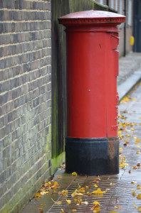
Red letterbox on a wet day with leaves on the foor

I was really looking forward to the colour module and was excited about the opportunity to experiment. However, in doing the exercises through the Autumn/Winter months I have been quite frustrated about my ability to find the colour combinations I wanted.

In controlling the strength of a colour I was lucky to catch the last of the Nasturtiums. Although I haven’t included it on the website I also repeated the exercise with a red post box just to test the results. It seems to me that as the image becomes underexposed it looks to have more of a blue hue and as it becomes overexposed it has more of a yellow hue.

As an aside I also found it a useful opportunity to get a better feel for using the manual controls on the camera and how I can use them to manipulate the image before using Photoshop.


October 27

Interlude: Photoshop training

Last year I did a digital photography course with the Open University and as part of the course I learnt the basics of Photoshop Elements. Although I felt I picked up some of the basics I never really used it enough for it to become second nature. In my infinite wisdom I decided to upgrade to Photoshop 6 this year and almost as soon as it was loaded I felt completely lost. Through a combination of tenacity and some usefully posted Youtube tutorials I once again got back to the basics but was determined I would get some specific training this year.

Finally, in September I went on a two-day course described as beginner/intermediate that covered the basics in terms of manipulation and improvement tools through to masks, special effects and puppet warps. Once we had got over the little glitch of the training provide taking me to the session on SPSS rather than Photoshop things got pretty hectic! There were only three of us in the class so there was plenty of individual attention and time to work through a really varied range of topics. By the end of the first day my brain felt like it was full to bursting. There were so many variations to experiment with and remember. The most common refrains throughout the day were ‘how does it do that?!’ or ‘that’s really cool!’ I had a bit of an experiment that evening on some of my images, just some gentle play with removing blemishes, cloning, selecting and generally finding out which tool did what.

Day two was even better as we really got into the benefits and possibilities of masks, colour images transformed into black and white, elements were added, removed and morphed. We had a lot of fun manipulating all sorts of images. By lunchtime the three of us were pretty dumbfounded so most of the afternoon was spent experimenting and asking final detailed questions.

I was so pleased I had taken the time and effort to really get to know the basics and am determined to keep practising so that my digital darkroom really supports the work I do with the camera. I think I do need to be mindful of not getting into the bad habit of thinking ‘oh it’s OK I’ll tidy it up in Photoshop!’
 

October 27

Curves

These were mainly shot over a couple of days in London. The weather was very overcast so I did struggle with some of the light. The cardboard structure came from an exercise we did at a conference and formed part of a City of Thought. Although the curves emerged slowly at first as with the other exercises once you start to spot them it seems that others quickly follow. It did find that that curves are a less common shape, possibly because of the locations I was in, and those that do exist, like the diagonals,  were generally man-made. Something I will look out for in future exercises.


October 27

Diagonals

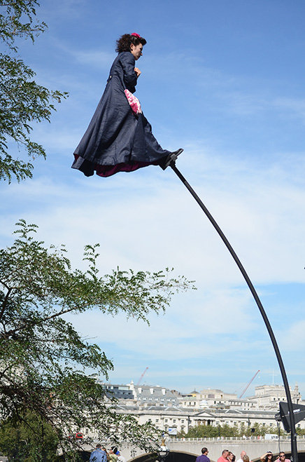
Peformed at the top of a Sway Pole at the Southbank Centre looking out across Waterloo Bridge
The Garden: FL 55mm 1/3200 f/5 ISO 400

The diagonals I found were predominantly man-made and within the built environment. Several appeared during my hunt for horizontals and verticals, often revealing the detailed structure of buildings. I was also fortunate to see Graeae Theatre Company’s outdoor performance piece ‘The Garden’ at the Southbank Centre in September. I was really pleased to get this image of one of the performers on her sway pole, hovering about the Southbank Centre. I particularly like the fact that you can see Waterloo Bridge and the London skyline in the background. It may be slitghtly more of a curve than a diagonal but it was one of the more unusual shots I took during this series of exercises.

October 27

Horizontal and vertical lines

I found I really got my teeth into this exercise and kept adding to it over a number of weeks. Once I had this topic as a focus I kept seeing lines everywhere, although it was sometimes a challenge to get an interesting composition. The images included were taken at the Olympic park and the University of York. As with many of the other exercises I found it so illuminating to really think about what I was looking at, to follow a trail of clues that might lead me to the subject matter I sought.


October 27

Multiple Points

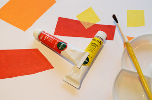
Paint Palette

White background with red and yellow shapes. Yellow paintbrush and palette lower left. REd and yellow paint tubes in the middle
Paint Palette: FL 30mm 1/30 f/5.6 ISO 400

I did this exercise several times with different objects and it was this version I preferred because of the arrangements and colours. I had previously tried jewellery making tools and findings as well as domestic tools but I really struggled to get the lighting right and this had an impact on whatever compositions I tried. Interestingly, this was the first time I felt I had become more concerned about the technology than the images.

Having abandoned earlier attempts I came back to the exercise and tried again with the painting materials. I felt much more comfortable with the compositions and colours and was more able to notice the impact that the addition of each new item or items had. Of them all I think I have a preference for the fourth in the series, I like its simplicity and the way your eye is led up and across the frame. Although I am aware that with all of them the lighting is a bit stark.