October 28

Reflections on Assignment Two

This was a challenging assignment that really made me look and think about the images I was trying to create. It was also a task that I particularly enjoyed. I think some images are better than others but overall I was very pleased with what emerged.

As with the last assignment I was fascinated to experience how one idea sparked something else, how simply playing with the different foodstuffs showed what might work and what didn’t. So, for example, I thought that working with sweet peppers would be very straightforward but I just couldn’t find the shapes and angles I was looking for. I did produce a few that made some peppers almost look like a coral reef but I didn’t think they were interesting enough compared to the other images.
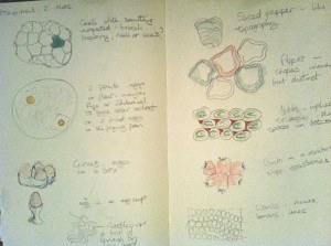
Sketches in a notebook that were used to inform my photographs
Sketching some initial ideas

I took the images over a two-week period, allowing time for ideas to germinate and to study what I had already produced. Several times I awoke with a new idea forming that I then tried out. Before I took any photographs I did some sketches in my notebook, working through various ideas for each of the themes before I even put eye to viewfinder. That way I felt I had some sense of what I was looking for when I started to lay out the foodstuffs. The first five or six ideas flowed fairly freely and then things slowed down and I felt I had to work harder to create some new approaches, I felt I was in danger of repeating the same sorts of images just using different foodstuffs. The one that eluded me for most of the time was verticals and horizontals.

I also started to introduce some quirks, things you might not expect to be there like the screw in the cabbage and the pins in the kiwi, things designed to make the viewer do a double take. During this time I came across the still life work of Olivia Parker, which has no doubt served as a source of inspiration and influence, not to claim that my photographs are anything like the quality of hers but they gave me an added sense of enthusiasm and showed that approaches to still life could be surreal and non-traditional.

In terms of the course criteria I worked hard on the design elements of this exercise trying to go with and respond to the characteristics of the foodstuffs I was using and thinking about them in different ways. I used a wide variety of materials from silicon baking sheets to dress-making pins and from raw prawns to turmeric. I would like to think my visual awareness is quite good in terms of framing and thinking about composition, although I am aware some images are stronger than others.

I think the quality of the outcome from this assignment is relatively consistent, I am still working hard on building my technical knowledge but definitely felt more confident in working with the camera this time. I bracketed a number of shots and used a fully manual setting for much of the time. As Autumn rolls in I was very conscious of the quality of the light changing; many of the shots for the exercises to date have been taken at my dining table with good availability of natural light but this light is becoming more unreliable and is available for a shorter timespan. There were various ideas included in my approach this time with influences from still life painting and photography, fashion photography, surrealism and just the plain quirky. At times I felt a bit constrained by the need to work with specific shapes and forms but I hope there is a clear sense of intention behind the various images I have produced.

There is no doubt that as I worked on the assignment my imagination expanded and I was trying to be more playful with the objects. Not least because of my own desire to keep things fresh and interesting. Perhaps this could have been taken further if I were more confident technically. I do feel my voice is developing and my style is emerging but I also want to make the most of this opportunity to experiment and not become too predictable too quickly.

As mentioned before I have done background research into the different approaches to still life from possible Japanese influences in utilising a few elements in a very clean form through to the odd juxtaposition of cauliflower and cross head screw. The use of the screw and the pins in the kiwi were in part intended to be playful but were also prompted by my response to Susan Sontag’s comment about photography being an act of aggression, I think she was primarily referring to the objectification of people but it got me thinking about how this might appear when shooting non-human subjects. Was it possible to show a sense of aggression or to have the capacity to disturb when working with foodstuffs?

It feels like this is was an assignment I could have spent months even years producing and I do want to make sure I take its influences forward.


October 28

Kevin Best

Since finding Olivia Parker I have also come across the work of Kevin Best. I was intrigued by his portfolio because he seems to have taken the Dutch Still Life painting influence to a whole new level. To the extent that he has purchased many authentic props from the era and where these have not been available he has set about making them himself.

As much as anything I was interested in my response to his work. On the one hand they are incredibly detailed and I love the chiaroscuro so redolent of the period he draws his inspiration from. For me however, they don’t have quite the impact of Parker’s work or the delicate contemporary references Anna Zahalka used in her series Resemblance I. I really admire the quality of his work and researching across these photographers has definitely helped me to think about how my own photographic voice might develop.

October 28

Olivia Parker

Dutch still life painting of cheeses, cherries and bread against a dark background
Clara Peeters (1594 – ca. 1657), Still life, ca. 1625 Los Angeles, LACMA

Having done the exercise around multiple points and setting up a form of still life I started to do some background research on the genre. At first it made me think of Anne Zahalka’s rich and beautiful tableaus and the influences of Dutch still life painting. During a web search I then came across the work of Olivia Parker. I hadn’t come across her photography before and was really taken with her approach.

I found the ‘Still and not so Still Life’ series incredibly beautiful. In one image objects and flowers appear to tumble down the frame. Delicate flecks of colour are highlighted against the almost solid black background. Where other images initially appear more like a traditional still life closer observation often reveals something quirky, surreal or disruptive. Hearts in jars, inverted landscapes reflected in glass bowls, shards of mirror. I found them exquisitely observed and very inspirational. They really encouraged me to think about still life in a new and more creative way. To look carefully at and work with the textures, colours and shapes of the objects I might use in future.

October 28

Everything was moving: Photography from the 60s and 70s

Front cover of the free guide to the Barbican Exhibition Everything was Moving
Thought provoking and moving

I was deeply moved by this show and can’t help but feel it will have a long lasting effect. There was, to my view, a stronger narrative thread in the downstairs galleries but that may in part be because a number of the photographers included there were much more familiar to me.

I spent two hours wandering through and thinking about the works and their meanings before I realised what the time was, not something I always experience in exhibitions. It is a multi-layered show touching on the social, political, economic, cultural and psychological. It is also in many ways very confronting, or at least I found it to be, from the appalling injustices of apartheid to Japan post Hiroshima and the impact the US has etched on the country. It certainly put me in mind of Sontag’s point about photography as an act of aggression and how this sat in relation to the fact that the content of many of these images is dealing directly with overt issues of aggression.

As a group show it also provided the opportunity to see a diverse range of techniques and approaches to the art of photography itself. From the hyper-real almost painterly large scale works of Larry Burrows to the sumptuous colour of Raghubir Singh. The works are beautifully observed and capture both the everyday and iconic moments. I couldn’t help but wonder how much the various photographers were aware of these possible distinctions at the time. All dealt with acute issues of the human condition and I think should make us consider where we have come to in the last fifty years. It put me in mind of the TS Eliot Poem Little Gidding, the last of The Four Quartets (1943):

We shall not cease from exploration
And the end of all our exploring
Will be to arrive where we started
And know the place for the first time.

More details on the show can be found on the Barbican’s Everything was Moving web page.


October 28

Assignment 2: Elements of Design

Pattern: Red Scales & Leeks

These two images were both examples of pattern and as a result also implied triangles. I was intrigued by the effect created by the moisture on the strawberries and that it made them almost seem ‘fleshy.’ This inspired later ideas in this assignment about presenting the food stuffs not quite as they are usually seen and juxtaposing unlikely combinations.

2 points: Salt & Pepper and Eggs & Flour

The salt & pepper and the eggs are obviously both examples of using two elements within a frame. The eggs were particularly difficult to work with because once they were dropped in the flour there was little I could change. As well as the focal points I was interested in exploring texture with both images. I was really pleased with the contrast of the glossy egg yolks against the powdery flour.

Curves and Rhythm:  Egg Cup and Spoons

The spoons were another attempt at creating a sense of rhythm in the frame.  I wanted to focus in on a detail of food preparation i.e. the herbs and spices but present them in such a way that they created an overall pattern. I also wanted to utilise the different textures and colours. The egg in the egg cup arose out of thinking about curves and I had sketched some thoughts around eggs and egg shells early on. The morning I took this photo there was very strong natural sunlight that I exploited to get strong contrast and emphasise the various curves present.

Single Points: Cauliflowers

Working with the cauliflowers was one of the ways I was thinking of creating a single point of focus that confused or played with expectations. Firstly by placing a piece of broccoli within the head of the cauliflower and then trying out something completely alien like adding the screw. With both approaches I wanted to use the different textures and shapes to highlight the contradictory points.

Diagonals and multiple points: Mushroom and Kiwi Beetles

The idea for using large mushrooms came to me early on in undertaking the assignment but I wasn’t sure how I was going to include them. Initially, I tried a number together to create a pattern but I didn’t feel the images worked particularly well. I then focussed in on a single mushroom and the diagonal emerged. With the judicious use of some dressmaking pins I pulled the two pieces together to accentuate the diagonal across the frame. I really wanted to capture the detail of the veins as they could be seen as diagonals in their own right.

The Kiwi Beetles were in part inspired by playing with the cauliflower. Again I had tried various configurations and when I looked at the early shots the hairs on the outside of the fruit intrigued me. They put me in mind of large spiders or beetles. So I thought I would play with that notion and used the pins to act as ‘legs.’

Distinctive shapes, horizontals & verticals: Pepper ribs and Pasta Sea

The pepper ribs were another attempt at creating some optical confusion and contradiction. Initially I was thinking about using the peppers to create a sort of topographical landscape but once I had sliced them up I couldn’t achieve what I had in mind. As I moved them to rethink the approach the slices fell in such a way that they looked like a rib cage. I then started to play with this idea and added the raw bacon to accentuate the illusion and move towards something slightly more grotesque than some of the other shots.

The horizontals and verticals had eluded me for most of the process but when I was working with the bacon it reminded me of the pancetta with its stripes of white fat so I decided to use this with the leeks. Thinking about these as ingredients for a pasta dish the pasta quills were then added. They looked to me like water lapping at the base of cliffs or around an island.

Several points in a deliberate shape: Prawns and Tomato Flower

Prawns was perhaps a more formalised composition compared to some of the others but I wanted to experiment with using just a few items to create a striking composition. I initially thought of the noodle nest and then the other elements followed. As a result of these ingredients I was partly inspired by the apparent simplicity of some Japanese graphics or paintings. As in one of the earlier exercises I added various items and moved them around until I felt I had found something that worked.

Tomato Flower was another approach to making the elements appear something they are not. The little Gem lettuce suggested an opening flower so I then used the parsley, carrot gratings and tomato to build the illusion of the stamens of a flower. I was particularly mindful of using the shapes and the colour to try and heighten the illusion.


October 27

Interlude: Photoshop training

Last year I did a digital photography course with the Open University and as part of the course I learnt the basics of Photoshop Elements. Although I felt I picked up some of the basics I never really used it enough for it to become second nature. In my infinite wisdom I decided to upgrade to Photoshop 6 this year and almost as soon as it was loaded I felt completely lost. Through a combination of tenacity and some usefully posted Youtube tutorials I once again got back to the basics but was determined I would get some specific training this year.

Finally, in September I went on a two-day course described as beginner/intermediate that covered the basics in terms of manipulation and improvement tools through to masks, special effects and puppet warps. Once we had got over the little glitch of the training provide taking me to the session on SPSS rather than Photoshop things got pretty hectic! There were only three of us in the class so there was plenty of individual attention and time to work through a really varied range of topics. By the end of the first day my brain felt like it was full to bursting. There were so many variations to experiment with and remember. The most common refrains throughout the day were ‘how does it do that?!’ or ‘that’s really cool!’ I had a bit of an experiment that evening on some of my images, just some gentle play with removing blemishes, cloning, selecting and generally finding out which tool did what.

Day two was even better as we really got into the benefits and possibilities of masks, colour images transformed into black and white, elements were added, removed and morphed. We had a lot of fun manipulating all sorts of images. By lunchtime the three of us were pretty dumbfounded so most of the afternoon was spent experimenting and asking final detailed questions.

I was so pleased I had taken the time and effort to really get to know the basics and am determined to keep practising so that my digital darkroom really supports the work I do with the camera. I think I do need to be mindful of not getting into the bad habit of thinking ‘oh it’s OK I’ll tidy it up in Photoshop!’


October 27

Curves

These were mainly shot over a couple of days in London. The weather was very overcast so I did struggle with some of the light. The cardboard structure came from an exercise we did at a conference and formed part of a City of Thought. Although the curves emerged slowly at first as with the other exercises once you start to spot them it seems that others quickly follow. It did find that that curves are a less common shape, possibly because of the locations I was in, and those that do exist, like the diagonals,  were generally man-made. Something I will look out for in future exercises.


October 27

Diagonals

Peformed at the top of a Sway Pole at the Southbank Centre looking out across Waterloo Bridge
The Garden: FL 55mm 1/3200 f/5 ISO 400

The diagonals I found were predominantly man-made and within the built environment. Several appeared during my hunt for horizontals and verticals, often revealing the detailed structure of buildings. I was also fortunate to see Graeae Theatre Company’s outdoor performance piece ‘The Garden’ at the Southbank Centre in September. I was really pleased to get this image of one of the performers on her sway pole, hovering about the Southbank Centre. I particularly like the fact that you can see Waterloo Bridge and the London skyline in the background. It may be slitghtly more of a curve than a diagonal but it was one of the more unusual shots I took during this series of exercises.

October 27

Horizontal and vertical lines

I found I really got my teeth into this exercise and kept adding to it over a number of weeks. Once I had this topic as a focus I kept seeing lines everywhere, although it was sometimes a challenge to get an interesting composition. The images included were taken at the Olympic park and the University of York. As with many of the other exercises I found it so illuminating to really think about what I was looking at, to follow a trail of clues that might lead me to the subject matter I sought.


October 27

Multiple Points

Paint Palette

White background with red and yellow shapes. Yellow paintbrush and palette lower left. REd and yellow paint tubes in the middle
Paint Palette: FL 30mm 1/30 f/5.6 ISO 400

I did this exercise several times with different objects and it was this version I preferred because of the arrangements and colours. I had previously tried jewellery making tools and findings as well as domestic tools but I really struggled to get the lighting right and this had an impact on whatever compositions I tried. Interestingly, this was the first time I felt I had become more concerned about the technology than the images.

Having abandoned earlier attempts I came back to the exercise and tried again with the painting materials. I felt much more comfortable with the compositions and colours and was more able to notice the impact that the addition of each new item or items had. Of them all I think I have a preference for the fourth in the series, I like its simplicity and the way your eye is led up and across the frame. Although I am aware that with all of them the lighting is a bit stark.