February 14

Equivalenices – Ansel Adams

After what was a pretty rotten morning thanks to train disruptions and general travel woes I was really looking forward to getting to the Ansel Adams show at the National Maritime Museum. I am not sure what I expected and I was intrigued about the link with the NMM, what I found was a truly awe-inspiring. Adams is well known as occupying a significant place in the history of photography, particularly as a consummate technician, but there was something incredibly emotional about being in such close proximity with this collection of prints.

They ranged from very intimate and small early works to enormous prints that I found quite staggering particularly in terms of the technology he had available to create them at the time.

Two things particularly landed with me on leaving the exhibition. Firstly, the notion of equivalencies that he developed from the influence of Stieglitz.

 When I see something I react to it and I state it, and that’s the equivalent of what I felt. So I give it you as a spectator, and you get it or you don’t get it, but there’s nothing on the back of the print that tells you what you should get.

Ansel Adams

I was incredibly struck by his notion of representing what he felt and this was something I don’t think I had truly understood in the way he created his work before.

The other thing that I was intrigued to hear from the film clips and interviews with Adams was this notion of seeing an image in his mind’s eye before he shot it. This is something I have increasingly noticed is important for me when I am doing my assignments and I think is in part why I have struggled with some of the colour exercises. I found it much harder to see beforehand what I was aiming for. To hear him talk of not making a shot before he had seen it in his subconscious was a real revelation.

When words become unclear, I shall focus with photographs. When images become inadequate, I shall be content with silence.

Ansel Adams
 

February 13

A story of curiosity

One of the joys of spending time at the British Museum was seeing the many different objects and talking about their possible stories. We were asked to consider what their adventures were to get here and I was fascinated to hear how different the stories were that emerged.

Coincidentally, I was also recently given the Wellcome Collection’s ‘Guide for the incurably curious’ and in it the stories of the collection are beautifully illustrated.

Henry Wellcome liked to recall how, as a very young child, he had found what his father explained was an ancient stone arrowhead, and example of a technology more important to its makers than the telegraph and the steam engines of his day. That inspired his imagination – and it also taught him how to use an object to tell a story.

Thinking back to connections the thing that connected both the British Museum and the Wellcome Collection for me was this interest in the condition of mankind, something that allows the coming together of disciplines, cultures and timespans – something articulated through stories.

Category: Blog | LEAVE A COMMENT
February 11

Waterproof rightness

Some people in life have a sense of waterproof rightness – you must not leak not knowing. You should know. A sort of learning to not learn. It is a challenge to hold open the option of learning to learn.

Nora Bateson

Category: Blog | LEAVE A COMMENT
February 9

Seeing patterns

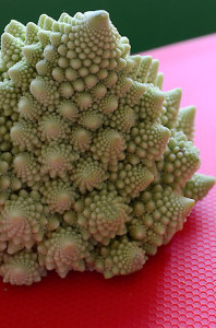
A Romanesco close up sitting on a textured red mat
The beauty of pattern

I was fortunate to attend the London Bateson Salon at the British Museum on Tuesday. It was a mixed group of consultants, academics, therapists, and a play worker, all connected by an interest in the work  of Gregory Bateson. It was delicately facilitated by Nora Bateson who managed to carefully relate the work  of her father and the work she  now does in her own right.

Many things were raised during the session that have since reverberated with   me.  We explored the patterns that might connect  the clock room, a crouched statue of Venus, the Elgin Marbles, a statue of Shiva, the Chinese figure and the gigantic Scarab.

When I bought this Romanesco yesterday it transported me straight back to the Museum and our conversations, it is such a beautiful example of pattern – the beauty of systems.

Category: Blog | LEAVE A COMMENT
February 8

Colours into tones in black and white

This exercise was really intriguing. I had played around with effects in Photoshop before but had never really stopped to look at the implications of trying out different ‘filters.’ It was helpful to apply them to the same shot and see the changes; how the blues, greens and reds in particular altered with each application.

I think this will be a very useful reference set for later work.

February 7

Colour combinations

This exercise felt less constrained than the others so I used it as an opportunity to play and experiment. I took photographs of colours that caught my eye. I really liked the back lighting on the peonies and how they became translucent, the vibrant violet against the red and the grey sky through the window.

The leaf on the car bonnet was purely opportunistic. I had taken my camera with me and had been photographing puddles and raindrops and then spotted the leaf. I was really attracted by the way the leaf became almost luminous against the blue backdrop.

I had spotted the barriers in the snow while driving home one afternoon and went back the following day with my camera, I really liked the way the red punctuated the almost monochrome backdrop of snow and road.

I also liked the way the red jacket interrupted its green surroundings. I probably didn’t have a long enough lens at the time, as it might have been more effective if the figure were larger in the landscape. Nonetheless, I thought it reinforced the relationship between red and green as complementary colours and how they interact when in a different ratio than the 1:1 of the colour relationships exercise.

February 6

Colour relationships

If I thought finding the primary and secondary colours was hard this exercise proved even trickier. Not only did I need to find specific colours but I had to think about them in a particular relationship to each other and also had to make some sort of composition that worked visually.

I’m not necessarily convinced I managed to get exactly the right ratios for each shot but the exercise certainly gave me a feel for the way complementary colours can work together. It was as we were taking down the Christmas decorations that the red and green idea came to me. I had moved the small artificial tree into the kitchen and as soon as I saw it against the red wall I grabbed the camera and started to play with different angles.

The blue and orange image started with me thinking about what I had in the house that was pure orange. I thought if I started with the orange I would then find a suitable blue to work with afterwards. I had several pieces of fruit and peppers but nothing that really inspired. I then remembered that my carrot, apple and ginger juice always came out very orange. This made me think of the jug and voila! The image should possibly feature more of the juice but this was the version that I preferred in terms of composition.

Finally, and the biggest challenge of all, was the violet and yellow. The inspiration for this one came some time after the others when I had to use the yellow cotton for something else. I wondered about using it in a close up with something, possibly some fabric but couldn’t find anything suitable. Then the peonies on the windowsill started dropping their petals and I just played with them and the cotton until something emerged. After much fretting about what to do this was the image I was happiest with of the group.


February 5

Primary and secondary colours

In line with the guidance for this exercise I tried as hard as possible to find naturally occurring colours rather than relying on painted or dyed surfaces. This became much more challenging than I had anticipated because of the onset of winter.  Not only was the colour palette becoming more limited outside the availability of natural light for taking the photographs was also an issue.

Probably unsurprisingly it was not too difficult to find green, although there was a wide range of possible tones. It was harder but not impossible for orange.

By the time I got to blue and violet it was becoming almost impossible and I was having to really look hard to find possible examples. Although as with previous exercises I did find that once I had an idea or spotted a possible colour it then generated other possibilities.

Working through the colour wheel of primary and secondary colours did take much longer than I had anticipated and although I was really looking forward to working with colour I did find it quite frustrating to have to be so specific about what I was looking for.

February 3

Connections

How do you make your connections?

Do you actively seek them out or do they find you?

Do you have a friend or colleague who is an important hub in building your connections?

Is it something you actively think about and manage or do your connections grow organically?

The likelihood is you probably use a combination of all of these things. I am aware that I probably don’t think enough about how my connections happen and who I should be linking up with. I am trying to be more active about building some diverse connections and moving beyond my usual sectors.

Category: Blog | LEAVE A COMMENT