Assignment One Contrasts
Assignment One – contrasts Dawn Langley 510320
This assignment required me to consider a basic design principle – that of contrast. We were given a list of possible contrasting pairs such as long/short; thick/thin; hard/soft etc and asked to create eight pairs that somehow expressed the essential differences between these qualities. Here is what emerged:

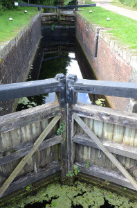
In this pairing I had the idea for the motorway as a ‘wide’ road first and that then led me to think abut the canal as its counterpoint. Using the tilted shot I tried to exaggerate the width of the M3, in the same way as the pointing of the lock gates seemed to emphasise the narrowness of this lock on the Basingstoke canal.There is no doubt that I was inspired by having recently been by the canals in Birmingham!
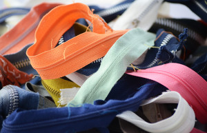
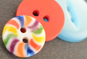
These are obviously more domestically based images and as such I wanted to create shots that were close up to the subject matter. I pondered about tidying up the zips and removing the cottons but as they have all been removed from old clothes this detritus seemed to me to be part of their story so I left them in.
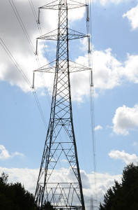
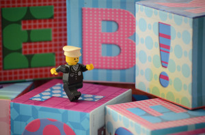
I took the shots of the pylons when I was photographing the motorway. They looked to me like giants walking through the woodlands. I thought this contrasted well with the small Lego figure that I combined with the alphabet blocks to try and give a sense of scale. I was also starting to explore the differences between found and ‘staged’ images.
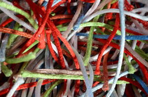
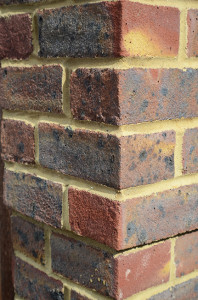
This pair was perhaps more difficult than I thought it might have been because it relies on cultural constructions to be able to make the meanings work. Soft and hard are sensory and generally based on touch so being able to convey them visually is more of a challenge. I am reliant on observers knowing that bricks are hard and the pile of a rug is soft.
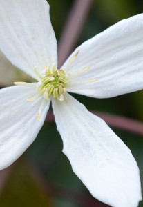
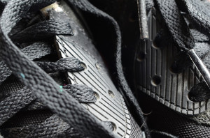
I wanted to try an unusual combination for black and white using contrasts not just between black and white but also natural and man made. They are both close up shots in an attempt to magnify the differences.
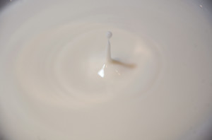
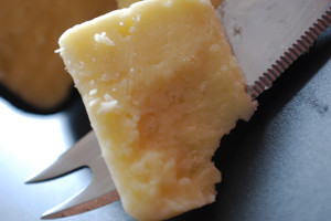
This is a pairing where I wanted to play with the elements, cheese being a ‘solid’ outcome of processing the liquid milk. I had never photographed dripping liquid before and it took a lot of patience to try and get anything that worked.
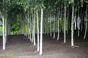
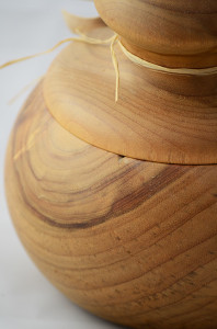
This pairing was also a slight play on the constituent elements. The straight planted rows of trees contrasted with the curves of the turned wooden jar.
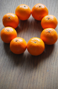
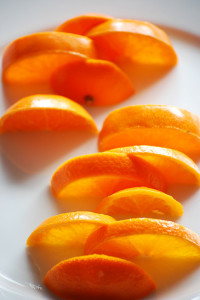
This final pairing came about as my confidence and ideas were growing. I wanted to play with the notion of circles being continuous and oranges came to mind this then led to thinking about cutting them into slices and taking out odd segments to create gaps.
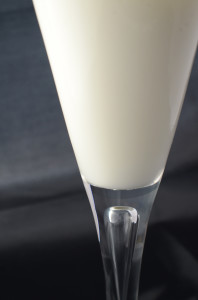
This final image is my interpretation of two contrasts in one, those of opacity and transparency. Milk in a wine glass set against a dark background. I didn’t want to make the subject too obvious so worked on the framing, positioning and colour of the glass and its contents against its background.